


For a long time, we have worked with styled-components, as the de facto standard for css-in-js tools. However, during research on how to optimize long tasks, we figured out that styled-components are one of the major bottlenecks in our project. That’s why we switched to Tailwind – a tool growing in popularity, thanks to its utility-first approach and significantly better performance, helpful for developers aspiring to optimize their applications.
Why speed matters
Performance is crucial for the success of any online business. Websites that load quickly and respond promptly to user input are more effective in engaging and retaining users compared to slower-loading websites that feel sluggish. Slow-loading sites have a negative impact on revenue, while fast-loading sites have been shown to increase conversion rates and improve business outcomes.
Performance is not only important for business outcomes but also a fundamental aspect of providing good user experiences. When websites contain excessive code, it requires browsers to consume significant amounts of the user’s data plan for downloading. Mobile devices, in particular, have limited CPU power and memory. This can result in poor performance conditions and, considering human behavior, people can only tolerate suboptimal conditions on a website for a limited amount of time before deciding to abandon it.
What even is Tailwind CSS?
Tailwind CSS is a utility-first CSS framework that offers a different approach to styling compared to traditional methods like styled-components. It provides a wide range of pre-defined utility classes that developers can use to style their user interfaces.
For example:
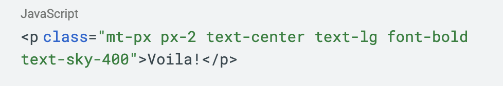
<p>: This standard HTML tag defines a block of text, creating a paragraph
class: Tailwind uses the standard class attribute to style elements
mt-px: Adds a tiny top margin to an element, equivalent to 1 pixel. “mt” stands for “margin-top” and “px” signifies the margin size in CSS pixels
px-2: Adds horizontal padding (left and right) of 2 units, typically 0.5rem or 8px if the root font size is 16px
text-center: Aligns the text inside an element to the center
text-lg: Sets the font size of the text inside a paragraph to a large size defined by Tailwind’s scale
font-bold: Applies a bold font weight to the text
text-sky-400: Applies a specific light shade of sky blue (400) to the text, as per Tailwind’s color palette which typically ranges from 50 to 900
This is the final output:

Instead of creating custom components or writing extensive CSS code, composing these utility classes together allows us to quickly build and style UI elements. This utility-first approach eliminates the need for writing repetitive CSS code and allows for rapid prototyping and iteration.
Tailwind CSS offers a comprehensive set of utility classes for various styling needs, including responsive design, spacing, typography, and more. These utility classes can be easily combined and customized to achieve the desired visual effects without the need for additional CSS.
By using Tailwind CSS, developers can streamline the styling process, reduce the maintenance overhead of custom components, and focus more on building functionality. The framework promotes a consistent and cohesive design system by providing predefined utility classes, ensuring a unified look and feel across the application.
So, why Tailwind?
We considered other options such as Griffel, Linaria, and Compiled. However, based on the parameters we established, Tailwind was the most suitable choice.
Some of the parameters we used to compare different options were:
Documentation quality
Performance & bundle sizes
Company backing the library
Size of the community
Framework agnostic or specific to React
Support for server-side rendering (SSR)
Support for theming
Support for Atomic CSS
Method of applying styles (classNames, styled components, CSS properties)
During our research, while auditing with Lighthouse, we discovered that using Tailwind can make certain components load approximately 26% faster. This improvement was significant enough to justify making the switch.
Migrating from styled-components to Tailwind
To ensure a smooth migration, it needed to be done in several phases:
Plan the migration process
Set up an initial configuration and prepare a quick guide for the team
Carry out the migration for each component
Analyze performance data and assess the differences
1. Planning the migration process
In order to successfully and efficiently migrate our project, it was of utmost importance to carefully break it down into smaller, more manageable components. By adopting this approach, we were able to focus on refining each component separately, using JIRA tasks as a means to track and streamline the development process.
Since our project is built using React and is set up as a Single Page Application (SPA), it was easy for us to analyze the different scenes users can interact with and break them down into JIRA tasks.
To kick things off and enable work to start on the aforementioned tasks, we first had to set up an initial Tailwind configuration in our project and also bring everyone up to speed with Tailwind.
2. Initial Tailwind configuration & quick start guide
As part of the second phase, we had to set up an initial Tailwind configuration in our project. The process was relatively smooth, with the framework integrating seamlessly into our existing setup. Having a well-documented and structured framework such as Tailwind certainly aided in this transition and allowed us to quickly incorporate the tool into our development workflow.
However, we encountered a unique challenge due to our repository’s structure; we had two teams working on two different projects within the same repository and this required us to create two distinct Tailwind configurations and build outputs, which we accomplished by using PostCSS as our preprocessor and setting it up accordingly. Each configuration was designed to cater to the specific project’s needs, while also ensuring that we didn’t inflate each other’s CSS bundle sizes.
Introducing two Tailwind configurations led to other challenges:
The Tailwind CSS IntelliSense plugin for Visual Studio Code is designed to find a single Tailwind config file by default and use it across the entire repo. Thankfully, there’s an experimental setting tailwindCSS.experimental.configFile that allows specifying multiple configs (fingers crossed it won’t be removed in the future!)
The Prettier Tailwind plugin, which automatically sorts classes according to the Tailwind team’s recommended order, also by default uses a single config and had to be configured for each project to target the appropriate one while also sharing the same top-level prettier config
Solving all of these challenges required careful planning and coordination between the two teams, but ultimately we were able to create a setup that allowed both projects to benefit from Tailwind’s utility-first approach to styling, without interfering with each other’s work.
As part of the same merge request for the initial setup, we refactored some smaller components from styled-components to Tailwind which served as examples and prepared a quick start guide to help both teams familiarize themselves with Tailwind and correctly set up their environments.
After this merge request was approved, we were able to begin the migration.
3. Executing the migration
For the most part, the migration was smooth. Notably, writing CSS in Tailwind was much easier compared to styled-components, which improved our overall developer experience (DX).
During the migration we decided to switch from internal to external CSS. We initially chose internal CSS during the initial setup for its simplicity, but we recognised the need to transition to external CSS since as the internal CSS size increased, it negatively affected the website’s performance. Additionally, external CSS facilitates caching, enabling faster page loads. If you’re interested in understanding the differences between Inline, Internal, and External CSS, consider reading this article.
We encountered a notable issue of incompatibility with older browsers, specifically Safari on iOS. Safari iOS versions below 14.5 do not support CSS properties like gap (for flexbox) or inset. Since we still support all Safari iOS 14 versions, we had to create a workaround. We developed a Tailwind plugin to register new dynamic utility styles using Tailwind’s matchUtilities() helper function, as shown below:
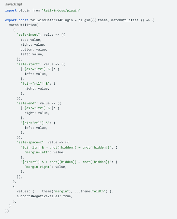
We’ve prefixed these new utilities with safe- so that, once we cease support for Safari iOS 14, the prefix can simply be removed. This will allow us to use the regular properties without any workarounds. Let’s briefly explain these utilities:
safe-inset uses the provided value and applies it to the top, right, bottom and left properties of the element
safe-start uses the provided value and applies to the “start” side of an element, taking into account the writing direction of the document. The “start” side is determined by the directionality of the text, meaning it will be either the left property in left-to-right (LTR) languages or the right property in right-to-left (RTL) languages
safe-end is similar to safe-start, but it applies padding or margin values to the “end” side of an element, respecting the writing direction of the document
safe-space-x is a modified space-x utility. It applies horizontal spacing between sibling elements within a container, with the added feature of respecting the document’s writing direction. This utility and the native space-y (for vertical spacing) are used instead of gap
If you’re curious about which technologies are compatible with different browser versions, consider visiting “Can I use”.
4. Analyzing performance data
After numerous changes and iterations, the entire project was converted to Tailwind. Once everything was released into production, we could finally start analyzing performance data to assess the real-world impact of this migration. It’s also worth noting that a decrease in this context signifies a positive change.
If you’re curious about where the changes were implemented and the data sourced, they are from the website kiwi.com. In advance, let me clarify: the homepage is simply that, the first page you encounter when you visit our website. The search results page, such as when you’re looking for return flights from Split to Barcelona, offers purchasing options for users. Feel free to visit and see for yourself; you might even find some affordable flights!
Core Web vitals
Google has invested substantial time and resources to define a set of user-centric performance metrics, known as Core Web Vitals. These are now accepted industry-wide as a standard for ranking websites. A good threshold to measure is the 75th percentile (P75), segmented across mobile and desktop devices.
Significant changes could be observed in the following metrics.
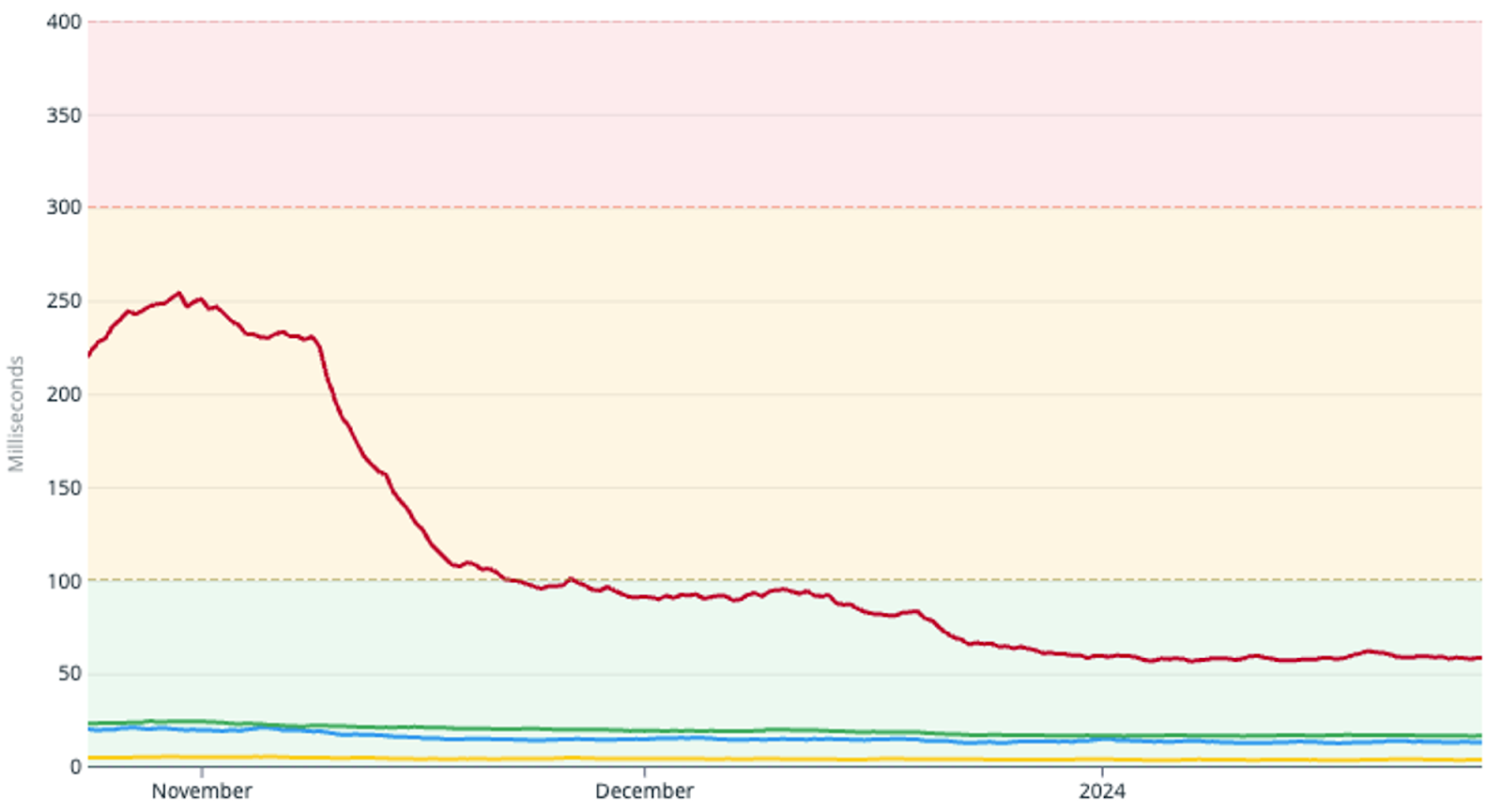
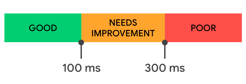
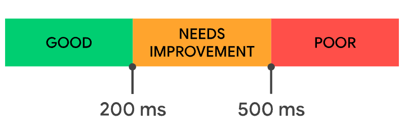
FID (First Input Delay)
On average, P75 shows a:
75.9% decrease (236.6ms → 57.1ms) for the homepage on mobile devices, indicated by the red line in the graph below
29.6% decrease (25.0ms → 17.9ms) for the results page on mobile devices, indicated by the green line in the graph below
37.1% decrease (21.0ms → 13.2ms) for the homepage on desktop devices, indicated by the blue line in the graph below
23.8% decrease (6.3ms → 4.8ms) for the results page on desktop devices, indicated by the yellow line in the graph below
The red, yellow, and green areas correspond to score categories, as depicted in the image below:
INP (Interaction to Next Paint)
On average, P75 shows a:
58.4% decrease (1,144ms → 475ms) for the homepage on mobile devices, indicated by the red line in the graph below
40.9% decrease (1,308ms → 772ms) for the results page on mobile devices, indicated by the green line in the graph below
49.7% decrease (366ms → 184ms) for the homepage on desktop devices, indicated by the blue line in the graph below
47.5% decrease (543ms → 285ms) for the results page on desktop devices, indicated by the yellow line in the graph below
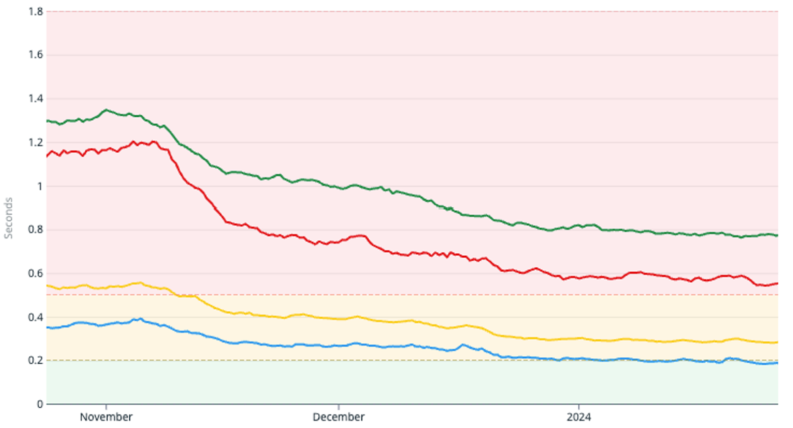
The red, yellow, and green areas correspond to score categories, as depicted in the image below:
Although our FID and INP results are still not flawless, primarily due to third-party factors, we have certainly seen some significant improvements by migrating to Tailwind. We observed a decrease in other CWV metrics, such as Largest Contentful Paint (LCP), but it was not particularly significant as the previous two.
Additional metrics
Server CPU wall time (latency) has also shown a noteworthy reduction from 10.19 seconds to 4.79 seconds, representing a 52.91% decrease. This implies a decrease in JavaScript execution time. As Tailwind doesn’t depend on JavaScript for styling, it reduces the CPU time required for style computation.
Finally, let’s talk about developer efficiency. Although we can’t provide specific metrics for obvious reasons, we have seen a significant improvement in our development speed and the feedback has generally been positive. Tailwind’s utility-first approach has made our CSS more readable and maintainable, allowing us to iterate faster and more efficiently. The reduction in the need for custom components has also reduced the complexity of our codebase, making it easier to maintain and understand.
Drawbacks
Initially, our bundle size saw a noticeable increase due to the inclusion of both libraries which is also evident in the metrics above. Their coexistence leads to redundancy in the generated CSS code, contributing to the larger bundle size.
Debugging becomes a tad more complex with Tailwind CSS compared to styled-components. Tailwind’s utility classes can make it trickier to trace styling issues back to their source, especially when they’re scattered across multiple elements. In contrast, styled-components’ encapsulated styles make debugging more straightforward by tying styles directly to components.
Moreover, Tailwind CSS introduces its own challenges with specificity resolution. Its utility classes rely heavily on the order of declaration, which can sometimes lead to unexpected styling outcomes. This inherent specificity struggle often pushes developers to employ JavaScript solutions like the “clsx” library to manage class composition dynamically. While this approach provides flexibility, it also introduces an additional layer of complexity to the styling workflow.
Conclusion
In conclusion, our migration from styled-components to Tailwind CSS has proven to be a boon for both our user experience and developer efficiency. The shift towards a utility-first styling approach has significantly improved our website’s performance, as evident from our Core Web Vitals metrics, and it has also streamlined our development process. Mobile devices experienced the greatest improvement as they are generally slower than desktop devices; thus, reducing Javascript usage significantly improved performance. While the migration process posed certain challenges, the benefits reaped have far outweighed the hurdles. Not all these successes can be attributed solely to Tailwind due to concurrent development of other features, but we believe that most can be credited to it.
We believe that prioritizing performance is crucial for any online business, and our journey stands testament to the fact that strategic decisions, careful planning, and the right tools can bring about substantial improvements in website speed and efficiency. We hope that sharing our experience will inspire and guide others who are considering a similar transition.
Extras
For more examples and documentation, make sure to check the official website. You can also use the Tailwind playground to start experimenting with it immediately!
If this article piqued your interest and you want to learn how other businesses have optimized their Core Web Vitals, consider exploring the following case studies: